Wednesday, 1 December 2010

Generations: Test Shoot 1

A big family outing to chase water turned out to be very fruitful for shooting pictures of my nephews.  I took along my camera and the idea was to shoot them in unstaged photographs just running about and doing as children do. 

I've decided to include one of the best shots of the day and also a shot that didn't turn out to be a great composition and isn't great technically but is still one of my favourites because of what it captured.

The equipment I used was a Canon 1000d slr, Canon Efs 18-55mm lens which is the standard kit lens I got with my camera.  I also had a Hoya polarising filter attached to the lens but at this point I had no idea what it was or how to use it.


Strong Cas                                                                      f/3.5   1/200sec   ISO-100
Casper picked up this log above his head and threw it.  Being a little slow I missed the shot but he kindly did it again for me.  I love the expression on his face, like an Olympic weight lifter.

I used the wide angle of my lens to try and capture the scale of the log and distort perspective slightly.  The camera was slanted to add drama and make it a more pleasing image over all.  I also noticed Richard and Daisy in the back ground and thought it would be nice to include them in the shot so I put Casper to the left hand side of the frame.  I have since cropped the picture to leave out some of the path that was on the left which has bought Casper back to the center.  The wide aperture was used to slightly blur the background and although I wanted Richard and Daisy in the photograph it kept Casper as the focal point.

Apart from cropping the image I also edited the colours and contrast of the image by using Image>New Adjustment Layer>Curves.  An 'S' curve increased the contrast by lightening the highlights and darkening the shadows.  To finish off the image I sharpened it a little using unsharp mask, although I am yet to perfect using this tool.

I am really happy with this image, I think it captures generations well especially with father and daughter in the background.  I think it is a strong composition and exposed well.


f/5.6   1/125sec   ISO-100

This image is one of my favourite from the day but is riddled with technical problems.  It is an unstaged shot which perfectly captures the relationship Gabriel has with his father.  I also like the way Jack is looking over his shoulder.

Anyway a long list of problems, To start with the light fooled my cameras meter and it exposed Jack quite well but underexposed poor little Gabriel leaving him in a very strong dark shadow.  I have fixed this the best I can using Layer>New Adjustment Layer>Exposure.  I then used the slider to adjust the exposure until Gabriel's face was exposed reasonably well.  Obviously this resulted in Jack being way over exposed so I used Edit>Fill and then painted in the exposure on Gabriel's face and shirt using the brush.  The result was that Gabriel was no longer in a deep shadow and the image was a lot better.

The image itself isn't very sharp at all and the overall quality is poor.  I tried to rectify this as best as possible using unsharp mask but sadly I couldn't improve it much at all.

Also the composition is rather poor and spoils the picture even further.  A distracting background with a head floating around is really disappointing.  I tried blurring it even more but wish I'd have used a wider aperture.  I could have waited until the background was clear but I may have missed the shot and to be honest I really wasn't thinking of the background at the time.

To enhance the contrast I used curves in a separate layer.

As you can imagine the un edited picture was in bad shape and although photoshop couldn't work miracles it certainly saved it from complete doom.

I feel like overall the day was a success because I have some lovely images and I have developed my skills using the camera and in photoshop.  I would like to be getting almost everything right inside the camera and only have to use photoshop for tweaking.  I also think I did well using the cameras flash to fill in shadows caused by the strong sun but a lot of this was down to luck rather than judgement.  Working with children was quite difficult but they were happy to take some direction when I needed something specific and it was a real joy to work with them.

Monday, 1 November 2010

Assignment Research: Tobias Zielony


Tobias Zielony is most well known for his work capturing and documenting the lives of young people in their everyday surroundings.  They often feature young people loitering or being involved in illegal activity and although this isn’t strictly “gangs,” the style in which he shoots is how I imagined some of my own work to look.


It seems that Zielony doesn’t focus on documenting the conditions people live in but how they conduct themselves, their self-portrayal and gestures.  This is a style of photography I really admire and would love to achieve myself.  Although my shots would be staged, Zielony’s works gives me great inspiration for the style and feel I would like to achieve.
The work that inspires me most is 'Curfew.'  It was shot in Bristol in 2001 and takes its name because it is mainly of teenagers hanging around after dark breaking Tony Blair's curfew law for young people.


This picture from the curfew series shows a group of teenagers hanging around on a common, smoking and burning a dustbin.  You get a real sense of boredom and in many ways the image reminds me of some of my own teenage years.  Not that I smoked and burnt bins but I can remember the boredom, not having anywhere to go and just hanging around with my friends.  This is why I think the photograph is so significant,  because it captures what life is really like for teenagers who come from poorer backgrounds.

The places where his subjects would meet include car parks, service stations, building entrances and many other places that would not be social hot spots if not for their presence.   The fact that these places are used intensifies the sense of boredom this is shown by a quote from a girl he photographed in Zielony's book 'Story, No Story'  "We're not bored.  Boredom is just a word for what we do anyway."

Tobias Zielony, Maik + Rico 2006, from the series: 'Big Sexyland'

This photograph taken from the series 'Big Sexyland' depicts two young men loitering in a Berlin park.  Zielony found the men in a porn cinema opposite the park.  Many of the subjects in this series worked as male prostitutes and Zielony photographed them waiting around in between action.  They would smoke, sleep and just hang around. 

He focuses on the way they conduct themselves, the way they move and gesture.  You also get the feel that Zielony doesn't take the picture from the perspective of being a by stander but as if he is a part of the group.  I think this is important because the images are not taken in a way to cast pity or judgement upon the subjects. 

He used artificial and infra-red lighting to capture the images in the series.  I don't know much about his type of lighting but I think it works well in the context he is taking the pictures.  You can see how dark it really is in the top right of the picture and with the light you almost get a sense that he is revealing something to you that you wouldn't know was there.

The work of Tobias Zielony captures young people in their every day surroundings.  What makes his photographs unique is that most are not from a fly on the wall perspective but as if he was one of the people in the photograph doing the very same things.  I feel as though he is lifting the curtain on behaviour that older people either think doesn't exist or turn a blind eye to.

Thursday, 28 October 2010

Initial Ideas

I have found it difficult to come up with interesting ideas because they must all relate to a single theme.  This in itself is not difficult to find inspiration for, its that my ideas are often unrealistic and I'd consider the images I have in my head to be almost unobtainable considering my current ability.

I have a desire to not only pass the course but to do something interesting and push myself as far as I can to get the best possible results.  I'm torn between simplicity and doing something I will be really proud of if it comes off.  I am undecided at this point but my initial ideas for themes are:

  • Generations
My idea was to shoot members of my family of varying generations going about their daily lives.  I consider this to be a fairly safe idea, it doesn't really get me too excited but i feel as though I can achieve this with my current skill set.

  • Horror
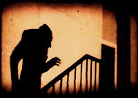
I thought I could shoot mostly at night and use shadows to create spooky images.  Most of my inspiration comes from films and I would love to create images that give the same sort of feeling you get when viewing a scary movie.  The negative thing about this is that given my current skills I would find it hard to get the images exactly how I want them using minimal light.

  • Crime
Drawing most of my inspiration from the film "The Bone Collector."  The images they saw in a book would correspond to different crimes and I would love to re create images like this in my own way.  The crimes would be fictional of course.
  • Gangs
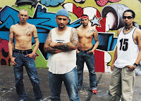
Initially I thought it would be great to venture into near by cities at night and capture real life gangs.  However I'm not Ross Kemp and I think not only would I struggle to get great images but it could be a little bit dangerous.  So I was thinking of using some of my friends and staging gang related scenes and portraits of mock gang members.  This idea is doable but has become slightly less appealing because I ideally would really like to capture true life images.
  • Politics
The idea is to create images that have a political message relating to the current time.  The main inspiration is the current governments cuts to spending in certain areas that could create hardship within fa
families from poorer backgrounds.  The problem is that I would need at least six images with a hard hitting message behind them and this could really strain the ideas pot as I only have a couple in my head.


Wednesday, 20 October 2010

Photoshop Task

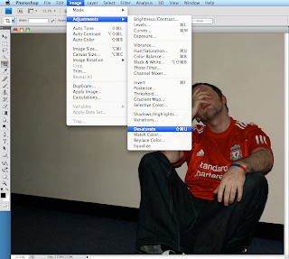
The task was to use photoshop to convert an image totally to black and white.  Then we had to make the image half in colour.

You can convert images into black and white using 4 main controls,

  1. Black and White
  2. Hue/Saturation
  3. Desaturate
  4. Channel Mixer
Each of the options give you a varying amount of control over the settings.  For example, Hue/Saturation gives you control over the Hue, Saturation and the Lightness where as Desaturate just turns the image into black and white with no control over the levels.


I used the desaturate tool to turn the original image into black and white.


Now using the selector tool I turned half of the image into black and white and kept the other half in colour.


Using the History Brush tool I was able to turn the shirt red while keeping the rest of the image black and white.  This tool can be used to make certain parts of a picture stand out.

Tuesday, 19 October 2010

Composition

The task is to take photographs which demonstrate good compostion.  Compostion is the way the photograph is structured to make it interesting to the viewer and more pleasing to the eye.


f/22    1/15sec    iso 400


This photograph was taken using a sty as a frame.  It also makes good use of the rule of thirds, the gate, the hillside and the sky, the tree is also about a third into the frame making the picture more pleasing than if it was in the center.


f/5.6    1/160sec    iso 200


This picture shows great texture on the cows face,  I also decided to crop the picture quite a lot to make it more dramatic.  I think that using a low apature has made the picture more pleasing by focusing on the detail on the cows head.  I am really pleased with how this picture turned out because I had to get pretty close to get it.  I also think the cow grazing in the background is a nice touch.


f/3.5    1/20sec    iso 400


I took this picture from a low view point and the idea was to make it look like the start of a journey.  Man and dog staring into the wilderness at the path ahead.  I wanted to just capture the legs and feet but this proved very difficult on a Yorkshire Terrier.  I think taking it from low down made the picture more dramatic than if it was taken from a mid height.


f/4    1/20sec    iso 400


This image uses leading lines to draw the viewer into the picture.  The gate on the left and the light area on the right are showing use of the rule of thirds.  The pillars either side are framing the picture.  I really like the way the picture goes from dark to light as you go down the path and i think this adds to the effect.

Apature Control Task

The task is to take photographs which demonstrate slow shutter speeds, fast shutter speeds, narrow depth of field and wide depth of field.  I managed to get quite a few decent shots on a family walk the other day and hopefully they demonstrate each of the elements of the task well.


Wide Depth Of Field

f/22     1/20sec     iso 200

I am happy with this picture, it seems to be lit well and not over exposed in the sunlight.  A high apature has left the whole image in focus and the low iso makes for better detail.

Narrow Depth Of Field

f/4.5    1/400sec    iso 400

The low apature has made the background blurred and only left the subject in focus.  A quicker shutter speed was used to limit the amount of light that hit the sensor and componsate for the wide apature.

Fast Shutter Speed

f/5.6    1/250sec    iso 200

I was reasonably happy with this picture,  my dog Abbie was running backwards and forwards at full pace so I tried to capture her mid run.  The reason I am a little displeased with the shot is because I feel I should have used a faster shutter to make the image sharper.  The reason why I kind of got away with it is because she is running almost head on so the variation in movment is less great than if I was standing to the side.

Slow Shutter


f/10    30sec    iso 400
No marks for originality here but after seeing a photograph of Parliament at night with the traffics' lights whizzing past I decided to do my own less good version.  It was the best way I could come up with to demonstrate a slow shutter.  I used the slowest shutter option available without going into bulb mode so the lights would stream continuously.  The mid range apature let in enough light to the sensor without compromising on the focus.  I am not too pleased with the picture because I made a school boy error, I used a tripod but forgot about the time delay function on my camera so I got a bit of shake.

Friday, 1 October 2010

First Day Out With The Camera

I went out yesterday over some local public footpaths in the countryside.  I just wanted to get a better understanding of the settings and try out a few of the techniques taught in class.

I was shooting in fully manual and needless to say, found it quite difficult.  The main areas I struggled with were exposure and the images could do with being a lot sharper.  Although I didn't really get any shots I was totally happy with, it was a good chance to learn more and have some practice.

Like a bit of a dumb dumb I uploaded the images without noting down the settings used, I wont make that mistake again :)

Here are my favourites...


I'm quite pleased with this shot as it came out almost how i'd planned.  A narrower depth of field has kept the subject in focus and blurred the background.  I would have liked the image to have been brighter, it was a sunny day and its came out quite dull in colour.


I used the wooden beams on the bridge and quite a low vantage point to draw the viewer into the picture.  Again with this shot something is not right with the colour.  You don't get the feel of the nice sunny day that I was going for.

Anyways, it's all a learning curve.  Hopefully they'll turn out better next time.

City and Guilds Photography Level 1

Hello there,

I have decided to go back to college to do an evening class in photography.  I've always been keen on taking pictures and getting the best possible shots when out and about with my compact, I just thought why not have a go at the proper stuff.

To complete my level 1 course I will be doing a certificate in specialist photography of people.  I will produce at least six thematic images demonstrating camera skills in my chosen theme.

I must plan and research my chosen theme and evidence all of this on this blog.  I will also research professional photographers whose work inspires me.

That's all for now,

Ian