For this unit I saw the images I wanted in my head. I then had the task of finding/thinking of suitable locations to capture each image I was thinking of. As a result of this each image was the result of a completely different location, four shoots spread over about two weeks.
I used my Canon 1000d slr with a sigma 18-50mm f2.8 standard lens. I was also forced to use my Canon speedlite flash gun on one of my shots due to insufficient light. The exposures would be long so to prevent camera shake I took my tripod to all of the shoots.
I decided to use an exorcist looking character for all of my shots, I wanted to create the sense that he moves around at night undetected and in a very mysterious way, this is how they would all link in with the horror theme. There were no legal or ethical considerations to take into account because it was all within the law and my own work. No companies or individuals would be cast in a negative way due to my photographs. The only thing we did consider was annoying other people so we worked quickly and as unintrusive as possible.
For health and safety we decided to wrap up warm because it was very cold. We wore sensible footwear and took a torch with us so we could see what we were doing.
The software I used to manipulate these images was Adobe Photoshop CS4 Extended.
 |
| f/2.8 1sec ISO-100 |
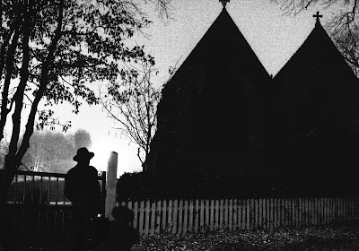
For the image above I used the widest available aperture and a low ISO to let in the most light without compromising on image quality. I achieved this by using a long exposure of 1 second and placing my camera on a tripod with a time delay. This prevented any blur from camera shake. I felt that it was important when shooting to look at the original photograph and see what it would look like after modification and not in its original state, this is how I prevented myself from discarding potentially good images.
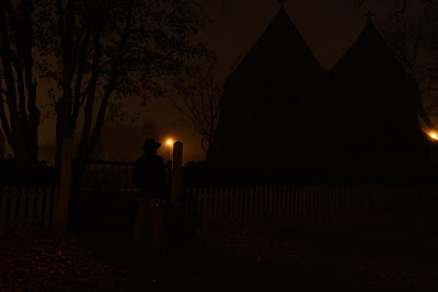
Below all of the pictures are the original images.
 |
| Church Original |
To achieve the finished product I converted the image to black and white using the desaturate tool. His jeans needed to look like dark trousers and I wanted the brief case to be black so I created a much darker exposure on a separate layer mask. I then painted in the darker exposure on the case and trousers. To create the overall film noir look I used Filter>Artistic>Film Grain and used the sliders Grain, Intensity and Highlight Area until I had the desired effect.
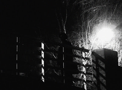
The next image was taken on a canal bridge about a mile from where I live, I thought the rails of the bridge would make the image more interesting than a normal style canal bridge.
 |
| f/2.8 2sec ISO-200 |
This image was created in exactly the same way as the first one using desaturate, the film grain filter and sliders.
 |
| Bridge Original |
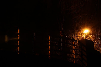
The original image initially failed the quality checks because you can see an image of the lens on the left hand side. I tried my best to get a shot without this in but because of the direct intense light it was not possible so I decided that I would crop it out.
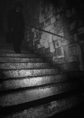
The following image turned out okay in the end but my original concept was to have the an intense light behind the subject. This was not possible so I had to resort to my trusty flash gun and adjust the exposure in photoshop later.
 |
| f/16 1/125sec ISO-200 |
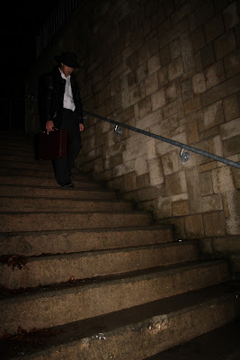
Again as with the other photographs I used the same tools to convert the image. What's different here is that the picture is illuminated from flash from the front, the opposite of what I wanted. I overcame this by focusing the flash on the steps and not on the subject, this only threw out enough lights to get the steps and the subject remained quite dark as if emerging from the shadows. It was still way too bright though so I layered in a separate exposure and painted it over the subject. I also wanted different intensity's of highlight area on the steps than the wall so I created two separate layers with different highlight area and intensity settings, using layer masks I painted the different settings over the wall and the steps. I also hated the white shirt so using clone stamp I cloned out the shirt making it look like the jacket was done up. The image was still too light so I painted a vignette style darkness around parts of the image.
 |
| Steps Original |
As you can see the original image is very different and would pretty much be useless without the power of photoshop but already knew when I was taking the images what I could do to get them how I wanted. If when I got back and uploaded them I couldn't get the effects I was hoping for then I would have gone out and re shot it.
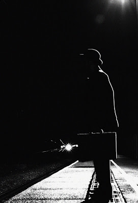
The final image is my favourite because of the overall finish and the concept of the picture. Waiting for a train illuminated by a street light. It was an added bonus and really contributes to the overall success of the picture when a train started coming along the line.
 |
| f/8 2sec ISO-200 |
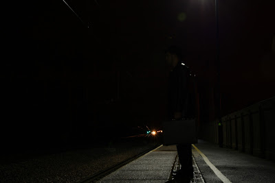
I used the the desaturate and film grain filter here too but the figure of the man was too bright again. I did my usual trick of painting on a separate layer but then he got lost into the dark background. I overcame this problem by using Layer>Blending Options>Bevel and Emboss. This gave the character a nice light outline as if coming from the streetlight, I tidied up any suspicious edges with the clone stamp. Selective sharpening using Unsharp Mask was done on the trains light to make it cut through the darkness more.
 |
| Train Station Original |
I cropped the original into portrait format to get rid of any areas that were not needed around the edges. I also think it suits the image better.
I am very happy with the images I got and my only regret is that I didn't have time to shoot the other shots I have in my head. I can cut and paste into photoshop also but I didn't feel it was necessary in achieving my desired look. I feel as though I have made a giant improvement in my use of Photoshop and am already using it competently. I know that I haven't even scratched the surface of what it is capable of doing yet and I look forward to improving my skills with this invaluable tool.
No comments:
Post a Comment